Appearance
表单
Switch
开关组件
| 属性 | 说明 |
|---|---|
| value | 当前开关状态 布尔值 |
| onChanged | 监听(开关状态改变时调用) |
| activeColor | 打开 状态 轨道 和 按钮颜色 |
| activeTrackColor | 打开 状态轨道颜色 |
| inactiveThumbColor | 关闭 状态按钮颜色 |
| inactiveTrackColor | 关闭 状态轨道颜色 |
| activeThumbImage | 打开 状态下按钮图片 |
| inactiveThumbImage | 关闭 状态下按钮图片 |
| materialTapTargetSize | 配置tap目标的最小大小 |
| dragStartBehavior | 确定处理拖动启动行为的方式。(没看出有什么变化) |
CupertinoSwitch
CupertinoSwitch 是 iOS 风格的开关
dart
import 'package:flutter/cupertino.dart';
class SwitchDemo extends StatefulWidget {
SwitchDemo({Key key}) : super(key: key);
@override
_SwitchDemoState createState() => _SwitchDemoState();
}
class _SwitchDemoState extends State<SwitchDemo> {
bool _switchValue = false;
@override
Widget build(BuildContext context) {
return Container(
child: ListView(
children: [
ListTile(
leading: Switch(
value: _switchValue,
onChanged: (bool val) {
setState(() {
_switchValue = val;
});
},
activeColor: Colors.orange,
activeTrackColor: Colors.pink,
inactiveTrackColor: Colors.grey,
inactiveThumbColor: Colors.blue[100],
),
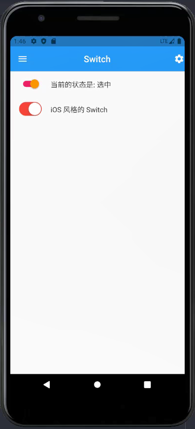
title: Text("当前的状态是: ${_switchValue == true ? "选中" : "未选中"}"),
),
ListTile(
leading: CupertinoSwitch(
value: _switchValue,
onChanged: (bool val) {
setState(() {
_switchValue = val;
});
},
activeColor: Colors.red,
trackColor: Colors.yellow,
),
title: Text('iOS 风格的 Switch'),
)
]
),
);
}
}
Checkbox
| value | 是否选中此复选框 |
|---|---|
| onChanged | 监听当复选框的值应该更改时调用 |
| tristate | 默认 false,如果为 true,复选框的值可以为 true、false 或 null。 |
| activeColor | 选中此复选框时要使用的颜色 |
| checkColor | 选中此复选框时用于复选图标的颜色 |
| materialTapTargetSize | 配置 tap 目标的最小大小 |
CheckboxListTile
可选中的列表
- onChanged 选中状态变更时间
- activeColor 选中时,背景色
- checkColor 选中时,对号的颜色
- title 主标题
- subtitle 副标题
- isThreeLine 是否显示三行。默认 false
- dense 是否密集垂直
- secondary 显示在复选框前面的小部件
- selected: text 和 icon 的 color 是否 是 activeColor 的颜色,默认 false
- controlAffinity 控件相对于文本的位置
- ListTileControlAffinity.platform 根据不同的平台,来显示 对话框 的位置(默认)
- ListTileControlAffinity.trailing:勾选在右,title 在中,secondary 在左
- ListTileControlAffinity.leading :勾选在左,title 在中,secondary 在右
dart
class CheckboxDemo extends StatefulWidget {
CheckboxDemo({Key key}) : super(key: key);
@override
_CheckboxDemoState createState() => _CheckboxDemoState();
}
class _CheckboxDemoState extends State<CheckboxDemo> {
bool _male = true;
bool _female = false;
bool _transgender = true;
bool _value1 = true;
bool _value2 = false;
@override
Widget build(BuildContext context) {
return Column(
children: [
ListTile(
leading: Checkbox(
value: this._male,
onChanged: (bool value) {
setState(() {
this._male = value;
});
},
),
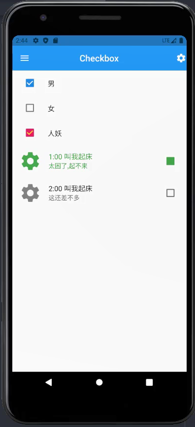
title: Text('男'),
),
ListTile(
leading: Checkbox(
value: this._female,
onChanged: (bool value) {
setState(() {
this._female = value;
});
},
),
title: Text('女'),
),
ListTile(
leading: Checkbox(
value: this._transgender,
onChanged: (bool value) {
setState(() {
this._transgender = value;
});
},
activeColor: Colors.pink,
checkColor: Colors.yellow,
),
title: Text('人妖'),
),
CheckboxListTile(
secondary: Icon(Icons.settings, size: 50),
value: this._value1,
onChanged: (bool value) {
setState(() {
this._value1 = value;
});
},
title: Text('1:00 叫我起床'),
subtitle: Text('太困了,起不来'),
activeColor: Colors.green,
checkColor: Colors.green,
selected: this._value1,
),
CheckboxListTile(
secondary: Icon(Icons.settings, size: 50),
value: this._value2,
onChanged: (bool value) {
setState(() {
this._value2 = value;
});
},
title: Text('2:00 叫我起床'),
subtitle: Text('这还差不多'),
),
],
);
}
}
Radio
单选框
| 属性 | 描述 |
|---|---|
| value | 单选的值 |
| onChanged | 改变时触发 |
| activeColor | 选中的颜色、背景颜色 |
| groupValue | 选择组的值 |
RadioListTile
可以单选的列表
| 属性 | 描述 |
|---|---|
| value | true 或者 false |
| onChanged | 改变的时候触发的事件 |
| activeColor | 选中的颜色、背景颜色 |
| title | 标题 |
| subtitle | 二级标题 |
| secondary | 配置图标或者图片 |
| groupValue | 选择组的值 |
dart
class RadioDemo extends StatefulWidget {
RadioDemo({Key key}) : super(key: key);
@override
_RadioDemoState createState() => _RadioDemoState();
}
class _RadioDemoState extends State<RadioDemo> {
int gender = 1;
@override
Widget build(BuildContext context) {
return Container(
child: Column(
children: [
Row(
mainAxisAlignment: MainAxisAlignment.center,
children: [
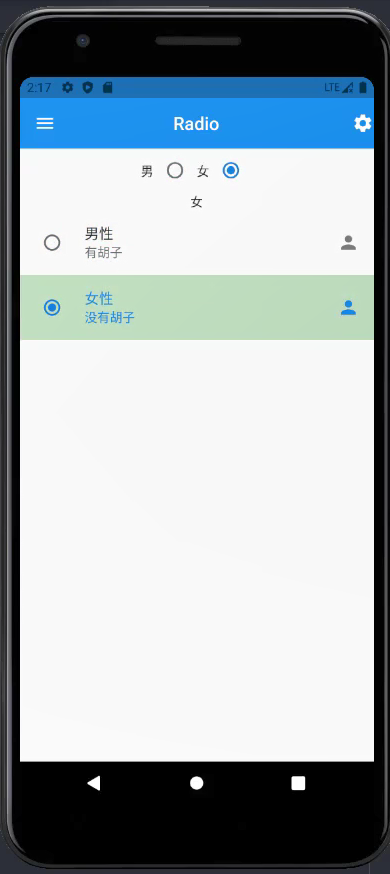
Text('男'),
Radio(
value: 1,
groupValue: this.gender,
onChanged: (value) {
setState(() {
this.gender = value;
});
}
),
Text('女'),
Radio(
value: 2,
groupValue: this.gender,
onChanged: (value) {
setState(() {
this.gender = value;
});
}
)
],
),
Row(
mainAxisAlignment: MainAxisAlignment.center,
children: [
Text(this.gender == 1 ? "男" : "女"),
],
),
RadioListTile(
value: 1,
groupValue: this.gender,
onChanged: (value) {
setState(() {
this.gender = value;
});
},
title: Text('男性'),
subtitle: Text('有胡子'),
secondary: Icon(Icons.person),
selected: this.gender == 1,
selectedTileColor: Colors.green[100],
),
RadioListTile(
value: 2,
groupValue: this.gender,
onChanged: (value) {
setState(() {
this.gender = value;
});
},
title: Text('女性'),
subtitle: Text('没有胡子'),
secondary: Icon(Icons.person),
selected: this.gender == 2,
selectedTileColor: Colors.green[100],
),
],
),
);
}
}
TextField
TextField 是一个 Material Design 风格的输入框,可以为输入框、密码框、文本域。
- autofocus 是否获取焦点
- keyboardType 键盘类型
- obscureText 设置为密码框
- decoration 样式修饰
- onChanged 内容更改时自动调用 - value
- labelText 标题
- hintText 提示文字 - placeholder
- maxLines 显示行数 - 大于1就是文本域
dart
class TextFieldDemo extends StatefulWidget {
TextFieldDemo({Key key}) : super(key: key);
@override
_TextFieldDemoState createState() => _TextFieldDemoState();
}
class _TextFieldDemoState extends State<TextFieldDemo> {
String phone;
String password;
String description;
_register() {
print(phone);
print(password);
print(description);
}
@override
Widget build(BuildContext context) {
return Container(
padding: EdgeInsets.all(20),
child: Column(
children: [
TextField(
autofocus: true,
keyboardType: TextInputType.phone,
decoration: InputDecoration(
prefixIcon: Icon(Icons.mobile_screen_share),
// 获取焦点时,高亮的边框样式
focusedBorder: UnderlineInputBorder(
borderSide: BorderSide(
color: Colors.green,
)
),
// 默认边框样式
enabledBorder: UnderlineInputBorder(
borderSide: BorderSide(
color: Colors.yellow,
)
),
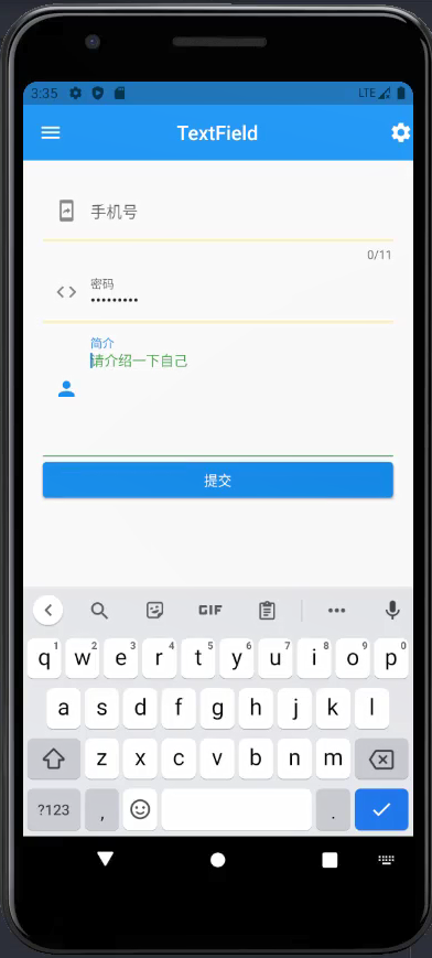
labelText: "手机号",
hintText: "请输入手机号",
hintStyle: TextStyle(
color: Colors.green,
fontSize: 14,
),
),
maxLength: 11,
onChanged: (value) {
setState(() {
phone = value;
});
},
),
TextField(
obscureText: true,
keyboardType: TextInputType.text,
decoration: InputDecoration(
prefixIcon: Icon(Icons.code_outlined),
// 获取焦点时,高亮的边框样式
focusedBorder: UnderlineInputBorder(
borderSide: BorderSide(
color: Colors.green,
)
),
// 默认边框样式
enabledBorder: UnderlineInputBorder(
borderSide: BorderSide(
color: Colors.yellow,
)
),
labelText: "密码",
hintText: "请输入密码",
hintStyle: TextStyle(
color: Colors.green,
fontSize: 14,
),
),
onChanged: (value) {
setState(() {
password = value;
});
},
),
TextField(
maxLines: 5,
keyboardType: TextInputType.text,
decoration: InputDecoration(
prefixIcon: Icon(Icons.person),
// 获取焦点时,高亮的边框样式
focusedBorder: UnderlineInputBorder(
borderSide: BorderSide(
color: Colors.green,
)
),
// 默认边框样式
enabledBorder: UnderlineInputBorder(
borderSide: BorderSide(
color: Colors.yellow,
)
),
labelText: "简介",
hintText: "请介绍一下自己",
hintStyle: TextStyle(
color: Colors.green,
fontSize: 14,
),
),
onChanged: (value) {
setState(() {
description = value;
});
},
),
// 声明按钮
Container(
width: double.infinity,
child: ElevatedButton(
onPressed: () {
_register();
},
child: Text('提交'),
),
)
],
),
);
}
}
CupertinoTextField
CupertinoTextField 和 TextField 基本一样,TextField 是基于 Material 风格的,而 CupertinoTextField 是 iOS 风格的输入框。
Calendar 日历
- CalendarDatePicker 日历选择器
- initialCalendarMode
- DatePickerMode.day
- DatePickerMode.year
- initialCalendarMode
- showDatePicker 日期选择器
- initialDatePickerMode (year | day)
- initialEntryMode(calendar | input)
代码示例:
dart
class CalendarDemo extends StatefulWidget {
  CalendarDemo({Key key}) : super(key: key);

  @override
  _CalendarDemoState createState() => _CalendarDemoState();
}

class _CalendarDemoState extends State<CalendarDemo> {
  @override
  Widget build(BuildContext context) {
    return Container(
       child: ListView(
        padding: EdgeInsets.all(15),
        children: [
          _showDatePicker(context),
          _showDatePickerForYear(context),
          _showDatePickerForInput(context),
          _showDatePickerForTheme(context),
          _showTimePicker(context),

          Text("CalendarDatePicker day"),
          SizedBox(height: 30),
          _calendarDatePicker(DatePickerMode.day),
          SizedBox(height: 30),
          Text("CalendarDatePicker year"),
          SizedBox(height: 30),
          _calendarDatePicker(DatePickerMode.year),
          SizedBox(height: 30),
          Text("_cupertinoTimePicker - hms"),
          SizedBox(height: 30),
          _cupertinoTimePicker(CupertinoTimerPickerMode.hms),
          SizedBox(height: 30),
          Text("_cupertinoTimePicker - hm"),
          SizedBox(height: 30),
          _cupertinoTimePicker(CupertinoTimerPickerMode.hm),
          SizedBox(height: 30),
          Text("_cupertinoTimePicker - ms"),
          SizedBox(height: 30),
          _cupertinoTimePicker(CupertinoTimerPickerMode.ms),
          SizedBox(height: 30),
          Text("CupertinoDatePicker - time"),
          SizedBox(height: 30),
          _cupertinoDatePicker(CupertinoDatePickerMode.time),
          SizedBox(height: 30),
          Text("CupertinoDatePicker - dateAndTime"),
          SizedBox(height: 30),
          _cupertinoDatePicker(CupertinoDatePickerMode.dateAndTime),
          SizedBox(height: 30),
          Text("CupertinoDatePicker - date"),
          SizedBox(height: 30),
          _cupertinoDatePicker(CupertinoDatePickerMode.date),
        ],
      ),
    );
  }

  ElevatedButton _showDatePicker(context) {
    return ElevatedButton(
      child: Text("showDatePicker"),
      onPressed: () {
        showDatePicker(
          context: context,
          initialDatePickerMode: DatePickerMode.day, // 日期选择模式,默认为天数选择
          initialDate: DateTime.now(), // 初始化选中日期
          firstDate: DateTime(2020, 6), // 开始日期
          lastDate: DateTime(2021, 6), // 结束日期
          initialEntryMode: DatePickerEntryMode.calendar, // 日历弹框样式

          currentDate: DateTime.now(), // 当前日期
          helpText: "日期选择器", // 左上方提示
          cancelText: "取消",  // 取消按钮文案
          confirmText: "确定",  // 确认按钮文案

          errorFormatText: "errorFormatText",  // 格式错误提示
          errorInvalidText: "errorInvalidText",  // 输入不在 first 与 last 之间日期提示
          fieldLabelText: "fieldLabelText",  // 输入框上方提示
          fieldHintText: "fieldHintText",  // 输入框为空时内部提示
          useRootNavigator: true, // 是否为根导航器
          // 设置不可选日期
          selectableDayPredicate: (dayTime) {
            if (dayTime == DateTime(2021, 1, 15)) {
              return false;
            }
            return true;
          }
        );
      },
    );
  }

  ElevatedButton _showDatePickerForYear(context) {
    return ElevatedButton(
      child: Text("showDatePicker - YearMode"),
      onPressed: (){
        showDatePicker(
          context: context,
          initialDatePickerMode: DatePickerMode.year, // 日期选择模式,默认为天数选择
          initialEntryMode: DatePickerEntryMode.calendar, // 日历弹框样式
          initialDate: DateTime.now(), // 初始化选中日期
          firstDate: DateTime(2015, 6), // 开始日期
          lastDate: DateTime(2025, 6), // 结束日期
          currentDate: DateTime.now(), // 当前日期
          helpText: "年份选择器", // 左上方提示
          cancelText: "取消", // 取消按钮文案
          confirmText: "确认", // 确认按钮文案
        );
      },
    );
  }

  ElevatedButton _showDatePickerForInput(context) {
    return ElevatedButton(
      child: Text("showDatePicker - InputMode"),
      onPressed: (){
        showDatePicker(
            context: context,
            initialEntryMode: DatePickerEntryMode.input,  // 日历弹框样式
            initialDate: DateTime.now(), // 初始化选中日期
            firstDate: DateTime(2020, 6), // 开始日期
            lastDate: DateTime(2021, 6), // 结束日期
            textDirection: TextDirection.rtl, // 文字方向

            currentDate: DateTime(2020, 10, 20), // 当前日期
            helpText: "helpText", // 左上方提示
            cancelText: "cancelText", // 取消按钮文案
            confirmText: "confirmText", // 确认按钮文案

            errorFormatText: "errorFormatText",  // 格式错误提示
            errorInvalidText: "errorInvalidText",  // 输入不在 first 与 last 之间日期提示

            fieldLabelText: "fieldLabelText",  // 输入框上方提示
            fieldHintText: "fieldHintText",  // 输入框为空时内部提示

            // initialDatePickerMode: DatePickerMode.day, // 日期选择模式,默认为天数选择
            useRootNavigator: true, // 是否为根导航器
            // 设置不可选日期,这里将 2020-10-15,2020-10-16,2020-10-17 三天设置不可选
            selectableDayPredicate: (dayTime){
              if (dayTime == DateTime(2020, 10, 15) || dayTime == DateTime(2020, 10, 16) || dayTime == DateTime(2020, 10, 17)) {
                return false;
              }
              return true;
            }
        );
      },
    );
  }

  ElevatedButton _showDatePickerForTheme(context) {
    return ElevatedButton(
      child: Text("showDatePicker - InputMode"),
      onPressed: (){
        showDatePicker(
          context: context,
          builder: (context, child) {
            return Theme(
              data: ThemeData(
                cardColor: Colors.red,
                brightness: Brightness.dark,
              ),
              child: child,
            );
          },
          initialDatePickerMode: DatePickerMode.year, // 日期选择模式,默认为天数选择
          initialDate: DateTime.now(), // 初始化选中日期
          firstDate: DateTime(2018, 6),  // 开始日期
          lastDate: DateTime(2025, 6),  // 结束日期
          currentDate: DateTime(2020, 10, 20),  // 当前日期
          helpText: "helpText", // 左上方提示
          cancelText: "cancelText",  // 取消按钮文案
          confirmText: "confirmText",  // 确认按钮文案
        );
      },
    );
  }

  ElevatedButton _showTimePicker(context) {
    return ElevatedButton(
      child: Text("showTimePicker - InputMode"),
      onPressed: (){
        showTimePicker(
          context: context,
          initialTime: TimeOfDay(hour: 10, minute: 30),
          initialEntryMode: TimePickerEntryMode.input,
          helpText: "时间选择器",
          cancelText: "取消",
          confirmText: "确定"
        );
      },
    );
  }

  CalendarDatePicker _calendarDatePicker(DatePickerMode mode) {
    return CalendarDatePicker(
      initialCalendarMode: mode, // 日期选择样式
      initialDate: DateTime.now(), // 初始化选中日期~
      currentDate: DateTime.now(), // 当前日期~
      firstDate: DateTime(2010, 9, 10),  // 开始日期
      lastDate: DateTime(2030, 9, 10),  // 结束日期

      // 选中日期改变回调函数
      onDateChanged: (dateTime){
        print("选择日期 $dateTime");
      },
      // 月份改变回调函数
      onDisplayedMonthChanged: (dateTime){
        print("选择月份 $dateTime");
      },
      // 筛选日期可不可点回调函数
      selectableDayPredicate: (dayTime) {
        if (dayTime == DateTime(2021, 1, 15)) {
          return false;
        }
        return true;
      }
    );
  }

  CupertinoTimerPicker _cupertinoTimePicker(CupertinoTimerPickerMode mode) {
    return CupertinoTimerPicker(
      mode: mode, // 展示模式,默认为 hms
      initialTimerDuration: Duration(hours: 5, minutes: 10), // 默认选中时间
      minuteInterval: 10, // 分钟间隔
      secondInterval: 10, // 秒间隔
      alignment: Alignment.center, // 对齐方式
      backgroundColor: Colors.amber[200], // 背景颜色
      // 滑动后,每次改变回调函数
      onTimerDurationChanged: (dayTime){
        print("选中时间 $dayTime");
      },
    );
  }

  Container _cupertinoDatePicker(CupertinoDatePickerMode mode) {
    return Container(
      height: 300,
      child: CupertinoDatePicker(
        mode: mode, // 展示模式, 默认为 dateAndTime
        initialDateTime: DateTime(2020, 10, 10), // 默认选中日期
        minimumDate: DateTime(2010, 10, 10), // 最小可选日期
        maximumDate: DateTime(2021, 10, 10), // 最大可选日期
        minuteInterval: 10, // 分钟间隔
        use24hFormat: true, // 是否采用24小时制
        backgroundColor: Colors.greenAccent[200], // 背景色
        onDateTimeChanged: (dayTime) {
          print("选择日期时间 $dayTime");
        },
      ),
    );
  }
}
Form
表单
- 使用步骤
- 创建表单 Form,并以 GlobalKey 作为唯一性标识
- 添加带验证逻辑的 TextFormField 到 Form 中
- 创建按钮以验证和提交表单
- Form 表达容器
- key GlobalKey
- child 子组件
- TextFormField 输入框
- 与 TextField 的区别:必须在 Form 内使用 & 带有验证器
- 需要验证的话,使用 TextFormField
- validator 验证器
Form 的主要用法有:
- 创建表单唯一键:final GlobalKey _formKey = GlobalKey();
- 验证表单:_formKey.currentState.validate()
- 提交表单:_formKey.currentState.save()
- 重置表单:_formKey.currentState.reset()
TextFormField
TextFormField 与 Form 结合在一起使用。(TextField 单独使用)
- validator(验证器)
- obscureText(密码框)
- onSaved(保存表单数据时调用)
- 设定表单字段的值
- 在 Form 的 save() 方法中执行
- onTap (被点击时调用)
- onChanged(表单数据变更时调用)
- onEditingComplete(编辑结束时调用)
dart
class FormDemo extends StatefulWidget {
  FormDemo({Key key}) : super(key: key);

  @override
  _FormDemoState createState() => _FormDemoState();
}

class _FormDemoState extends State<FormDemo> {
  final GlobalKey<FormState> _formKey = GlobalKey<FormState>();
  String _phone;
  String _password;

  @override
  Widget build(BuildContext context) {
    return Container(
      padding: EdgeInsets.all(20),
      child: Column(
        children: [
          Form(
            key: _formKey,
            child: Column(
              children: [
                TextFormField(
                  decoration: InputDecoration(
                    hintText: '手机号'
                  ),
                  validator: (value) {
                    RegExp reg = new RegExp(r'^\d{11}$');
                    if (!reg.hasMatch(value)) {
                      return '手机号非法111';
                    }
                    return null;
                  },
                  onSaved: (value) {
                    print('_phone onSaved');
                    _phone = value;
                  },
                ),
                TextFormField(
                  obscureText: true,
                  decoration: InputDecoration(
                    hintText: '密码'
                  ),
                  validator: (value) {
                    return value.length < 6 ? "密码长度不够": null;
                  },
                  onSaved: (value) {
                    print('_password onSaved');
                    _password = value;
                  },
                )
              ],
            )
          ),
          Row(
            children: [
              Expanded(
                child: ElevatedButton(
                  onPressed: () {
                    if (_formKey.currentState.validate()) {
                      print('提交成功');
                      // 提交表单
                      print('_formKey.currentState.save() - Before');
                      _formKey.currentState.save();
                      print('_formKey.currentState.save() - After');
                      print(_phone);
                      print(_password);
                    }
                  },
                  child: Text('提交'),
                )
              ),
              SizedBox(
                width: 20,
              ),
              Expanded(
                child: ElevatedButton(
                  onPressed: () {
                    _formKey.currentState.reset();
                  },
                  child: Text('重置'),
                )
              )
            ],
          )
        ],
      ),
    );
  }
}